The book is the N.
Two books stand as the uprights of an N, and a gold book leaning between them draws its diagonal. A shelf from afar, a letter up close.
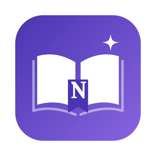
Before
A generic open book, with the N reduced to a small tab that disappears at icon sizes.
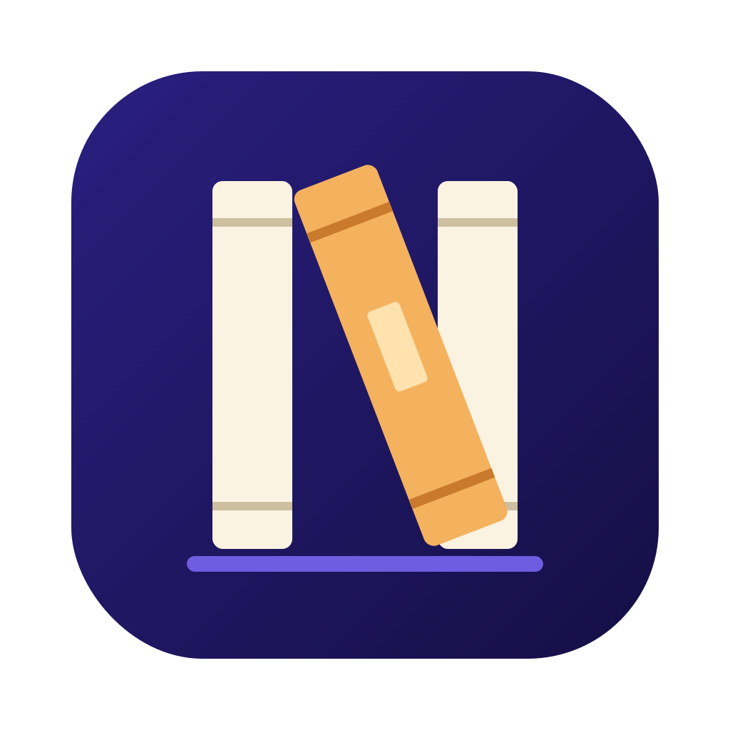
Now
The whole mark is the letter: two standing books for the uprights, a leaning gold book for the diagonal, all on one shelf. Cream and gold against night indigo keep it legible down to 16 px.
NovlyNovlyOne mark, everywhere.
The website and every Mac app icon size are generated from the same vector artwork. The name is set in Lora, matching the literary typography of the site.
At favicon size the two cream books and the gold diagonal still read as an N; the spine bands and the shelf appear as the icon grows. Night indigo, paper cream and book gold are the brand colours.
Download the vector artwork